

If you're paying for the click, send it to a landing page. If the person found you on their own, whether through a Google search for your brand name or a friend's recommendation, send them to your homepage. That's the whole rule. The exceptions (single-product stores, high-ticket B2B sales) get their own checklist below, but if you only read one sentence in this guide, that's the one worth bookmarking.
TL;DR:
- Paid traffic should be directed to dedicated landing pages that match the ad's promise, not the homepage, to improve conversion rates and ad quality scores.
- Homespages must clearly answer what the company does, who it's for, and what action to take within five seconds, to prevent bounce rates and build trust quickly.
- Use a single, strong value proposition and message match on landing pages, avoiding unnecessary navigation and minimizing form fields to maximize conversions.
- Testing small changes like headlines, form length, and CTA wording with limited traffic provides faster insights and saves money before scaling campaigns.
- Sending organic and brand search traffic to the homepage is appropriate, but niche SEO keywords outperform general pages if converted through purpose-built SEO landing pages.
Table of Contents
- Homepage vs Landing Page: What Each One Actually Does
- What Goes Into a High-Converting Landing Page
- What Belongs on an Effective Homepage
- When Should You Use a Landing Page vs a Homepage?
- Design and Conversion Tactics That Actually Move Numbers
- How to Measure What's Actually Working
- Mapping SEO and Paid Traffic to the Right Page
- Fast Fixes for the Mistakes That Kill Conversion
- Testing Channels Cheaply Before You Build Anything Big
- What I'd Actually Prioritize With Limited Time or Money
- Test Your Offer Before You Build Anything Permanent
- Sources
- FAQ
Homepage vs Landing Page: What Each One Actually Does
Most founders think a landing page is just "a smaller homepage." It isn't. The two exist for opposite reasons, and confusing them is probably costing you money right now.
A landing page is a standalone page built for exactly one action. Someone clicks an ad, opens an email, or follows an affiliate link, and lands somewhere designed to make them do one specific thing: buy, sign up, or book a call. According to Mailchimp's definition, landing pages typically strip out site navigation entirely, because every link that isn't the CTA is an exit ramp you built yourself. There are two flavors worth knowing:
- Lead-generation landing pages trade something (a discount, a guide, a demo) for contact information, usually through a short form.
- Click-through landing pages warm up a visitor with more detail and proof, then push them to a purchase or signup page.
A homepage, by contrast, is your site's front door. It's the hub visitors land on when they don't have a specific transaction in mind yet. They're exploring, comparing you to competitors, checking if you're legitimate, or trying to figure out what you even do. A homepage has to serve dozens of different visitor intents at once: investors, job seekers, existing customers, and first-time browsers all show up on the same URL.
This is where message match becomes the concept that separates pages that convert from pages that leak visitors. Message match means the words on your landing page mirror the words in the ad, email subject line, or search result that got someone there. Visitors don't read carefully when they feel confused; they just leave. A homepage doesn't need this kind of message match because it isn't answering one specific promise. It's answering the general question "what is this, and is it for me?"
What Goes Into a High-Converting Landing Page
Building a landing page that actually converts comes down to ruthless focus. Every element either supports the one action you want, or it gets cut.
- Hero section with one USP and one CTA. State the single sharpest benefit in a headline, back it with one supporting line, and put a button above the fold. Resist the urge to list three benefits when one strong one will do.
- Copy that mirrors the ad or email, word for word where possible. If your ad says "Free 14-day trial, no card required," your headline should say close to the same thing. This is message match in practice, and Neil Patel's research shows ad-to-page consistency drives measurably better results in paid campaigns.
- Trust and urgency elements placed near the CTA, not buried in a footer. A testimonial, a customer logo, or a security badge sitting right next to your button does more work than the same element scrolled three sections down.
- Navigation decisions based on offer complexity. For most campaigns, cut the header nav completely. But Unbounce's research found that a totally blank header can backfire on high-ticket or complex B2B offers, where buyers want to verify you're a real company before handing over an email address. In those cases, a minimal header with an "About" or "Trust" link outperforms a completely stripped one.
- A layout that matches the goal. Lead-gen pages front-load the form; click-through pages front-load proof and push the form or buy button lower after the visitor is warmed up.
The payoff for getting this right isn't small. Omniture's research on dedicated landing pages found an average 25% lift in conversion rate when campaign traffic hits a dedicated page instead of a general site.
Pro Tip: Before you write a single word of landing page copy, open the ad or email you're driving traffic from and highlight the exact phrase you used as the hook. That phrase becomes your H1. It's the cheapest conversion win available and it takes ten minutes.
What Belongs on an Effective Homepage
Your homepage has a much harder job than any single landing page, because it has to work for people you know nothing about yet.
The hero section needs to answer three questions inside of five seconds: what do you do, who is it for, and what should I do next. Shopify's guidance on homepage design frames this almost like an elevator pitch condensed into a headline and a button. If a stranger can't answer those three questions from your hero alone, they'll bounce before scrolling.
Beyond the hero, an effective homepage typically includes:
- Full navigation, because visitors arrive with varied intents and need to self-select a path (pricing, product, blog, careers).
- One primary CTA that stays visually dominant, with secondary CTAs (like "learn more" or "see pricing") styled to look clearly less important.
- A trust bar: customer logos, review scores, or press mentions placed high enough to be seen without scrolling.
- Product or category discovery blocks that let different visitor types find their own path forward.
First impressions form faster than most founders expect. Nielsen Norman Group's research on homepage design points out that users judge a site's credibility in a matter of milliseconds, largely off visual consistency and how clear the hero messaging is. A cluttered, inconsistent hero doesn't just look unpolished. It actively erodes trust before anyone reads a word of your copy.
Performance matters just as much as layout here. Mobile-first design and load speed aren't nice extras. They're conversion mechanics. A slow homepage on a phone loses visitors before the hero even finishes rendering, and that's traffic you already earned through SEO or word of mouth, which makes it more expensive to waste than a paid click.

When Should You Use a Landing Page vs a Homepage?
Here's the decision checklist, built around the traffic source rather than the page itself:
- Paid search or social ads → landing page. You're paying per click. Every visitor who lands on a general homepage and can't immediately find what the ad promised is a click you paid for and didn't convert.
- Email campaigns → landing page. You wrote a specific subject line and a specific offer. Send readers to a page that matches that exact promise, not your general site.
- Affiliate or influencer links → landing page. These visitors arrive with a specific expectation set by someone else's words, not yours. Message match matters even more here because you don't control the referring copy.
- Branded search (someone Googling your company name) → homepage. They already know who you are. They want the full picture, not a narrow funnel.
- Customer support, careers, or investor traffic → homepage. These visitors need navigation, not a single CTA.
- Organic content or SEO discovery → usually homepage, sometimes a dedicated SEO landing page if the search intent is narrow enough (more on that below).
Neil Patel's guidance on routing traffic backs this same split: paid and campaign traffic to landing pages, organic and brand traffic to the homepage, because it improves both conversion rate and ad efficiency at the same time.
A few edge cases deserve special handling. Single-product stores often blur the line entirely. If your homepage only sells one thing, your homepage functionally is a landing page, and that's fine. Don't force an artificial split. Promotional microsites for a limited-time launch or seasonal offer behave like landing pages even if they carry your brand's full visual identity. High-ticket B2B sales are the trickiest case: buyers want a fast, focused pitch, but they also want proof you're a legitimate company before they'll fill out a form, which is exactly why a minimal trust-oriented header outperforms a completely blank one in that context.
The underlying logic in every case is the same: match the page to what the visitor already believes about you. A cold click needs a narrow promise kept immediately. A warm, curious visitor needs room to explore.
Design and Conversion Tactics That Actually Move Numbers
A simple copy structure beats clever copy almost every time on a landing page: Hook, Offer, Proof. Open with the pain point or desire in one line. State the offer plainly in the next. Follow immediately with proof, whether that's a number, a testimonial, or a demo screenshot. CTA microcopy should describe the outcome, not the mechanics; a button that implies what happens after the click ("Get my free audit") tends to outperform a generic instruction ("Submit").
Form friction kills more conversions than bad design does. If you're collecting a lead, ask for the absolute minimum up front: usually just an email. Progressive profiling (asking for more detail on a second interaction, after trust is established) consistently beats a long form on the first visit.
Performance work is unglamorous but it's often the highest-leverage fix available:
- Your hero image is usually your Largest Contentful Paint element. Serve it as WebP or AVIF, preload it, and keep the file size lean, ideally under roughly 200KB, to protect your Core Web Vitals score.
- Make mobile CTAs large enough to tap without zooming; a button under 44 pixels tall is a common, avoidable mistake.
- Cut navigation to zero or near zero on conversion-focused pages. Every extra link is a decision the visitor didn't come to make.
Pro Tip: Run this exact experiment before you touch your full-scale ad budget: write two headlines, split traffic 50/50, and let 100 to 200 clicks decide the winner before you write a single word of the rest of the page. Small samples won't give you statistical certainty, but they'll usually reveal an obvious loser fast enough to save you money.
Three cheap tests worth running before committing real budget: swap the hero headline while keeping everything else fixed, test form length (one field versus three), and test CTA button copy across a handful of variants. None of these require a developer or a big budget, just traffic and patience.
How to Measure What's Actually Working
Two numbers matter more than the rest combined: conversion rate (conversions divided by visitors) and cost per acquisition (ad spend divided by conversions). Everything else, including time on page, scroll depth, and bounce rate, is a secondary signal that helps you diagnose why the primary numbers move, not a goal on its own.
When you're testing, change one variable at a time. Testing a new headline and a new CTA color simultaneously means you'll never know which one caused the shift you saw. For founders without massive traffic, classic statistical-significance A/B testing often isn't realistic within a reasonable timeframe. A practical workaround:
- Run tests longer instead of demanding a huge sample; directional signal over two weeks beats a coin-flip decision made in two days.
- Treat a large gap (25% or more) as worth acting on even without full statistical confidence; treat a small gap (5% or less) as noise.
- Watch for consistency across multiple small batches rather than trusting one lucky day.
Attribution gets messy fast when you're changing the ad, the landing page, and the offer all in the same week. Isolate variables where you can afford to: test creative first with a stable landing page, then lock the winning creative and test the page. If conversion improves after a page change but the ad and audience stayed fixed, you've found your lever. Scale spend only after a change survives more than one testing window, not after one good day.
Mapping SEO and Paid Traffic to the Right Page
Paid traffic converts better on a dedicated landing page for a structural reason, not just a design preference. Search platforms score ad quality partly on message match between the ad and the destination page; Google calls this component of Quality Score "landing page experience." A generic homepage rarely scores well here because it wasn't built to answer one narrow promise, which quietly inflates your cost per click even before conversion enters the picture.
Organic and SEO traffic works differently. If someone searches your brand name, send them to the homepage; that's what they're expecting. But if you're targeting a specific long-tail phrase with real commercial intent, like "affordable project management software for freelancers," a purpose-built SEO landing page focused on that exact phrase usually outperforms a homepage trying to rank for everything at once.
A few hygiene rules protect your search visibility when you build these pages:
- Give campaign landing pages their own clean URL structure rather than burying them in query parameters, which search engines and analytics tools both handle poorly.
- Use canonical tags carefully if you run near-duplicate landing pages for different ad platforms, so you don't split ranking signals across near-identical content.
- Set up 301 redirects, not 404s, when a campaign page's promotion ends and you retire the URL. A dead link from an old ad still gets clicked for months.
Fast Fixes for the Mistakes That Kill Conversion
Most conversion problems trace back to five repeat offenders, roughly in order of how much damage they do:
- Sending paid traffic to the homepage. This is the single most expensive mistake on this list. Build a dedicated page, even a rough one, before you scale spend.
- Weak message match. If your ad promise and headline don't match almost word for word, rewrite the headline today.
- Buried or missing CTA. If a visitor has to scroll to find the button, move it up.
- Slow load times, especially on mobile. Compress your hero image first; it's usually the biggest single fix available.
- Too many competing CTAs on one page. Pick one goal per page and hide the rest.
Fix them in that order. The first two alone typically account for most of the wasted spend founders see when a campaign underperforms.
Testing Channels Cheaply Before You Build Anything Big
You don't need a finished landing page to learn whether a channel is worth your time. An hourly ad slot, the kind BidSurvivor auctions on its board, works as a cheap proof-of-concept: claim an empty hour for free, point it at a rough one-page offer, and watch the click numbers that get published publicly against every brand on the board.
What to watch during a run like this:
- Click-through rate on the slot itself. This tells you whether the audience even notices your listing.
- Conversion rate on whatever you point the click toward, even if it's just a waitlist form.
- Whether results hold across more than one hour. One good hour could be luck; three consistent hours is a signal.
If a slot sends you a handful of clicks and zero interest, that's useful information cheaply bought, not a failure. If it sends you consistent signal, that's your cue to build a proper landing page around whatever message worked and put real budget behind testing that channel further. Small-sample public click data won't give you certainty, but it will tell you faster than a week of guessing whether a channel deserves more of your time.
What I'd Actually Prioritize With Limited Time or Money
If you only have a few hours this week, spend them fixing message match on whatever page your paid traffic currently hits, not redesigning your homepage. That single fix usually returns more than any visual polish you could add.
Two moves, in order: build a rough one-offer landing page for your current top traffic source, even an ugly one, and run a small paid test against it before you touch a homepage redesign at all. Once you have even 100 or 200 clicks of data, you'll know more about what to fix than any amount of internal debate would tell you. Let the early numbers decide whether you iterate on the same page or scale the channel that's already converting. Guessing costs more than testing does.
— Sienna
Test Your Offer Before You Build Anything Permanent
Most founders build a full landing page, launch a campaign, and only then find out whether the headline or the offer resonates. BidSurvivor flips that order. Its board sells hourly advertising slots by live auction, split into four six-hour windows a day, where the highest bid holds the slot and anyone can take it back by paying more. The first bid on an empty hour costs nothing and needs no account, which means you can put a rough offer in front of real traffic before spending a dollar on a proper page.
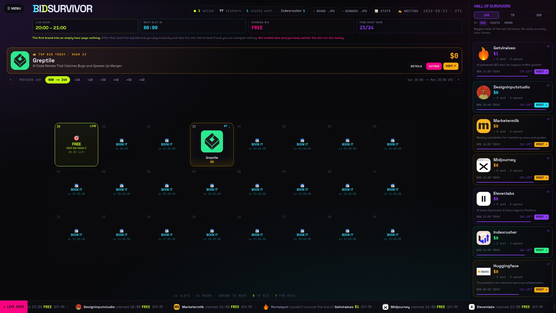
This fits indie makers and founders testing a headline, a positioning line, or a new offer with a small budget, not brands running large-scale campaigns. Every brand's click numbers are published publicly before anyone bids again, so you can see exactly what a given slot has historically sent before committing anything. If a headline gets clicks, you've earned the confidence to build a real landing page around it. Check BidSurvivor's board for an open hour and claim it before someone else does.
Sources
- 7 Benefits of Using Landing Pages — Unbounce
- Homepages vs Landing Pages: Where to Drive Paid Traffic — Neil Patel
- What is a Landing Page? Definition and How to Use — Mailchimp
- Homepage design principles — Nielsen Norman Group
FAQ
What Is the Difference Between a Homepage and a Web Page?
A homepage is a specific type of web page: the main entry point of a site, usually reachable from the root domain. "Web page" is the broader term for any individual page on a site, including product pages, blog posts, and landing pages.
What Is the Difference Between a Splash Page and a Homepage?
A splash page is an interstitial screen (often an age gate, language selector, or promotional announcement) that appears before the homepage loads, while the homepage is the actual hub visitors use to navigate the site. Splash pages add a click before value, which is why most modern sites avoid them outside of legal requirements.
What Defines a Landing Page?
A landing page is a standalone page built around a single action, typically without site navigation, and it's designed to convert traffic from a specific ad, email, or link rather than serve general browsing. Mailchimp's definition splits these into lead-generation pages, which capture contact details, and click-through pages, which warm up a visitor before a purchase.
What Is the Difference Between an Entry Page and a Landing Page?
"Entry page" is an analytics term for whatever page a visitor first arrives on, whether that's a homepage, a blog post, or a dedicated landing page. "Landing page" specifically refers to a purpose-built page designed around one conversion goal, so every landing page is technically an entry page, but not every entry page is a landing page.
Should a Small Startup With One Product Still Build a Separate Landing Page?
If your homepage already sells one thing to one audience, it's functionally already a landing page, and building a second one just to split traffic rarely helps. The split matters most once you're running multiple campaigns or ads with different messages that a single homepage can't match individually.
Recommended
- Every ad platform shows you the winners
- The advertising that lasts forever is the advertising nobody sees
- What $200 actually buys you on Google Ads
- Why the first brand into an empty hour pays nothing
This article was produced with AI assistance and reviewed by AI for accuracy. It is provided for general information only and is not professional advice.